Friday, 30 April 2010

Thursday, 29 April 2010
Question 5 - Who would be the audience for your media product


Carmen Lopez is an 18 year old girl who attends Imperial college. Carmen is a true Londoner who has been accustomed to city life for as long as she can remember. She despises romance and men in general. She is into sport, computers and computer games, fashion, money and make up. She is part of a feminist movement in her university. She studies a computer science degree and loves the technical side to it. She rarely shows any emotions and hasn't got many friends. In her free time she enjoys watching violent/twisted films such as Texas chainsaw massacre and all the Saws films. She enjoys the twisted plots in films, sometimes original and sometimes normal plots. She enjoys writing what's on her mind, collecting weapons and going to the cinema.
Question 2 CONTINUED - How does your media product represent particular social groups

 This is compared with a scene from "Saw." Our product tries to represent a young male with being unable to control his usual "tough/manly" characteristics when in danger. This was achieved mainly through directing the acting and emotions which the character showed and also partially the shots used. The close ups intensified his emotions. Similarities with how characters are represented here is firstly both look helpless because they are both tied up. Both seem in agony and stressed. Both are young males showing emotions which are uncommon for that type of social group.
Question 2 - How does your media product represent particular social groups
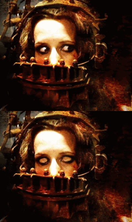 I chose to compare this scene with the scene from Saw 3 where Amanda has her mouth tied. Both you could say are young people. They are represented to be young, in fear for their lives and helpless. One similarity is that both people are restricted from using there mouths whilst they are in danger. Another similarity is that both scenes used extreme close ups to show the true extent of emotions. Another is that they are both in a dangerous situation and under threat. Amanda is represented as a normal young woman and just an unlucky victim just like in our one.
Evaluation Question 1 CONTINUED - Comparing (2nd part)

Wednesday, 28 April 2010
EVALUATION Question 1 - In what ways does your media product use, develop or challenge forms and conventions of real media products

Image 1 above is "Candi Studios." This is our college name which we used to represent our studio from which the film was created. The sound effects were sharp and dramatic which represented the suspense side to the film. The colours used represented the evil/romantic side to the film. The red represented the bloody side and also the romantic side. The black background not only made the title stand out more but also created a sense of suspense. This is a normal code for a film which we followed.

Image 2 above is our title "unexpected." The colours red and black represented the bloddy, romantic and scary side to the film. The font was formal, old fashion like and the effects used were professional and created suspense.

Image 3 above is a shot showing the production manager. Here the font was kept formal and the colour used was red. The mise en scene was the table cloth and candles which showed a romantic side. The shot focuses on the boy and girl holding hands with the title running smoothly on the bottom right hand corner which is professional and created suspense. This also sets the tone for the rest of the movie. Getting to know the characters and a little information on what the film is about would be one of the codes and conventions for the beginning part of a film.

Image 4 above shows the producers. The title scrolls out slowly. This intensify the scene because the girl is giving a scary stare into the mirror. This develops the forms of real media because in other film sequences you see the same time of title sequence. The font and colour intensify the scene also and makes it look scarier.

Image 5 above shows the director title. The font and colour is kept the same throughout the title sequence firstly because we felt that this was the most intense style and effect we could have and we wanted to keep the suspense going throughout and also by keeping it the same it kept it professional. This challenges the codes and conventions of most movies because it jumps straight into a very intense scene. Most of the time you would see a title sequence of calm and slow shots whereas we put an intense scene so close to the beginning during the title sequence.
Question 7. what i have learned from the progression from the preliminary task to the full product
1A) Two Shot 1B) Two shot
Both 1A and 1B are shots which contain two people. 1A is a scene from our opening and this is where Japhet and Leonora are at the table. So here we have a two person shot were the audience can get a clear veiw of both of them at the dinner table, as this helps to set the scene for the romance in our romantic thriller. In shot 1B there is a two shot of Japhet and Leonora at the table finding out that she is pregnant. In shot 1B, there was not a lot of space, so we had to squeeze to try and get a perfect shot of both of them. However, for our title sequence we made use of space, and we got a clear shot of both characters.
2A) Match cut door 2B) Match cut door
Both 2A and 2B are match cuts of Leonora opening the door. We did not have a clue on how to do a match cut so we just tried and did what we thought was correct, as scene on shot 2B. We do not see Leonora opening the door straight away, instead there is a lengthy gap, that waste's time, then all of a sudden we see her entering the room. In comparison to our title sequence 2A, we see a clear match cut of her opening the door from the inside then walking out we had to makesure that it looked clear and cut there is would not be that obvious that it was filmed in two seperate shots.
3A) Feet 3B) Feet
Both 3A and 3B are shots of Leonora's feet as she is walking. The thing that we done good in both shots, is that we used the 360 degree rule and we did that to perfection. In 3A, we made good use of space and had her walking for about 5 seconds however, in 3B we did not use that much space,this was to be honest due to lack of space where we were infact filming. but in 3A during filming we used and had to make iuse of the space we had in order to make her walking dramatic thats why sound was added however also very mysterious and dramatic. but to set a thriller romance tone.
4A) Lighting 4A) Lighting
In shot 4A and 4B, we are focusing on the lighting. in 4b the lighting was very bright due to the fact it was film on college sit. so the lighting was bright but we thought that in factv it was perfect for the scene as we were talking about a serious topic. however in 3a the light was alot more dimmer due to the fact we had to set the scene for a romantic thriller but at this specific point it was a candle lit dinner so the lighting was very important. we also had to makesure that it wasnt to dim to film as we did not use extra lighting.
Monday, 26 April 2010
question 3 and 4 what kind of media institution might distribute our media product and why?
 The video which we found on youtube was a Btec and media abduction. It had 470 views and two pages full of comments and responses of views to there opening one comment was "Really good". We think that this is the kind of response in which we will get due to the fact it is a low budget film and maybe the content of there film resulted in the comments which were made. but the fact that there film was actually noticed by people was useful due to the fact it was opening made by students, which such a low understanding of the film industry altogether however they still managed to do well. further more the internet helped in oder to launch this movie due to the fact it has become worldwide for others to see.therefore when other students come to do there work they would have found an example which could help or a inspiration for there work.
Monday, 19 April 2010
Question 8) Audience feedback and comment

 This is an image of part of the audiences' reaction at the green screen. Annika of the left looks horrified, as she is braced up in her sit. Leonora in the middle, looks happy, as she saw herself on the big screen. Yolande on the right, looks confused.
Wednesday, 31 March 2010
Font Activity

Thriller sub genres
- Comedy
- Detective & Mystery
- Disaster
- Fantasy
- Romance
- Sports
- Supernatural
- Thriller-Suspense
- adventure
- action
Art of the title sequence
 The Shining
Tuesday, 30 March 2010
Monday, 29 March 2010
Wednesday, 24 March 2010
rough cut
What we liked
As a group, we decided that we liked the soundtrack because we thought that it fits the genre, which is a romantic thriller. We liked the sound effects, we feel it creates suspense, the creeking of the door and the footsteps.
Problem
At 39 seconds, the audience are suppose to hear the natural sound, of the actor making noises. We decided as a group to cut the end, where she stabs him with the knife and, replace it with a lcose up of her face, giving a evil look. And we need to add the rest of the sound track and sound effects, and put on the credits.
Wednesday, 3 March 2010
Card game Practice
- Shot reverse shot of the table. This continued every time we added something new to the table.
- Panning of the room in a fast speed.
- Zooms in and out of the cards suddenly appearing on the table.
- Zooms in and out of the hands appearing on the table playing cards (boy & girl).
- Cross cuts between a plain table, spinning chair and cards scattered on the table.